The Xerox Smalltalk-80 GUI Was Weird
As part of my ongoing interest in the origins of object-oriented programming and design patterns like MVC, I started to think the best way to fully grasp these things was to go back to the beginning. While there are modern Smalltalk’s like Squeak, Pharo, and Cuis that retain a lot of the old-school vibe, they’re also pretty different.
I could go into detail on how all of those options aren’t quite what I’m looking for, but since I want to write about that later, the short version for now is that I started looking into how you could emulate the original Smalltalk-80 environment on modern hardware. That ended up being incredibly easy when I found this “by the Bluebook” implementation of it on GitHub.
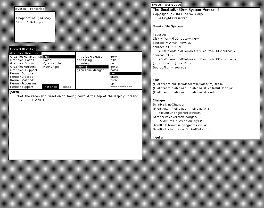
After a couple minutes installing, I got it running and saw this:

At first glance, this looks incredibly similar to something like the desktop of the Apple Lisa or early Mac OS. It’s easy to see why people might think that Apple sort of stole the graphical user interface from it’s rich neighbor Xerox. It’s not true, though.
The first thing is that the Smalltalk environment wasn't really an operating system the same way something like Mac OS was. It’s more like an IDE that runs on bare hardware.
For example, there’s no traditional file system. Smalltalk environments were stored as images which contained the entire state of the system. That means all of the objects, code, data, whatever, were stored as Smalltalk objects. The creators of Smalltalk wanted to make a system where the person using it was also modifying and programming the system as they used it. That’s really cool as a programming environment, but not really how we think of normal people using computers today.
There’s also no desktop, icons, or pull down menus. The whole desktop metaphor isn’t really there, because that isn’t really what it was. It’s sort of pure in an appealing way. There aren’t many different categories of things there. Windows, pop-up menus, lists. Not a lot. You can collapse different windows you’re not using and organize them on your screen, but they’re all just still windows, as opposed to also having icons for files and folders and apps and other sorts of things.

If you want to do anything with a window, you might notice there’s no controls. All window operations are done modally, meaning you click, select what you want to do, and then do that thing. You can’t even move or resize a window by clicking and dragging. There is click and drag for scrollbars and text, but not for windows. Weird.

If you wanted to move this window you would select “move”, which collapses the window and ties it to your mouse location. You then move your mouse to wherever you want the window to be and click again to place it. Oh, and you can only click, because there are no key commands in this system whatsoever.
Looking at all of this together, yeah, the Lisa and Macintosh took a lot from Xerox. But, they also added a lot. The Smalltalk environment was a revolutionary GUI, but it was still a system you would have had to have been a computer operator or something to really use. It’s not a personal computer at all.
The fact Apple was able to see the potential and then figure out all of the metaphors and affordances which needed to be there for regular humans to use a computer like this, and that they got so many of those things right by the time of the original Macintosh is pretty incredible.