Look away from PowerPoint and take a look at three new ideas instead
Presentations are a crucial part of your professional life. In my line of work, presentations function as introducers, reports, training, proposals, summaries and explainers. Sometimes, presentations are watched in person or through web conferencing. Other times, they appear on websites for browsing or e-learning.
To do the job, many people will start PowerPoint, plunk in many words in bullet points and let their “showmanship” do the rest.
Your old ways of doing PowerPoint are no longer enough

Since the pandemic and remote work changed the ways we work today, the demands on presentation have also changed drastically:
- A “presenter” may no longer be present. You might not even be visible through a Zoom Window. Some presentations are watched in a video. Some people may even view your presentation on “mute” or by continuously scrolling to the “interesting” points.
- Your audience consumes content differently these days. If I wanted to read a wall of bullet points like this one), I would rather read an article. Worse, if the content doesn’t engage, I lose the audience. You also want the audience to come back to you too.
- Some studies claim that an audience’s attention span is about 20 minutes. Context matters. You might be forced to sit through the entire presentation like at a conference, but your attention still has to be maintained. Viewing it from home or somewhere else, you must get to the point quickly.
As a lawyer, I seem to have endless things to say. Figuring out how to say it? That’s the tricky part. Your personality and style contribute to your best presentations. Reading a block of bullet points on a template PowerPoint presentation wouldn’t bring that out. You would need opportunity, practice and feedback—all the time.
If you want to look at new ways of doing things, I wrote this post for you.
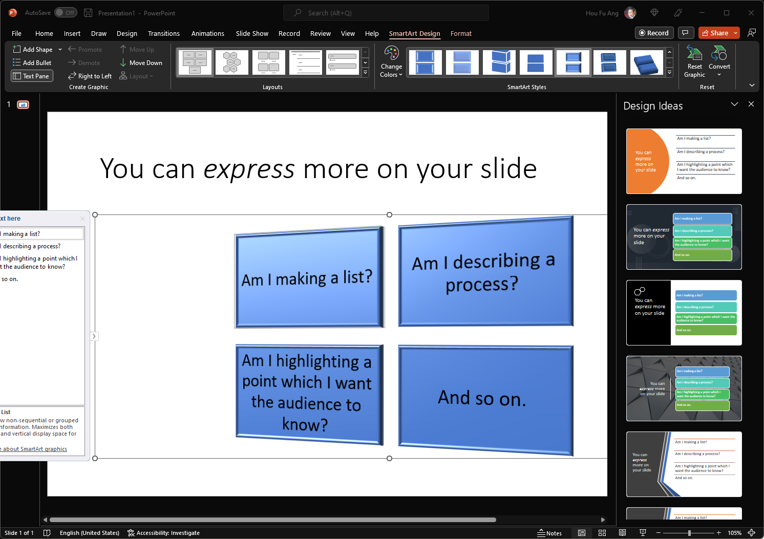
You can express more on your slide.
I found that the easiest way to improve your presentation is to abandon bullet points. The first step towards approaching any slide is to think about its purpose:
- Am I making a list?
- Am I describing a process?
- Am I highlighting a point which I want the audience to know?
- And so on.
Once you know what you want, it becomes evident that bullet points aren’t the only way to achieve them. A process can be described with arrows, steps or even a map. A list can be made of post-its, boxes and maybe even articles (for example, a list of news items can be illustrated with “newspaper clippings”). Such design elements will help an audience, no matter how far they are from you, to get the point.
Since presentations aren’t my core area of work, I don’t find myself being able to come up with a design quickly. A quick reference could be helpful.
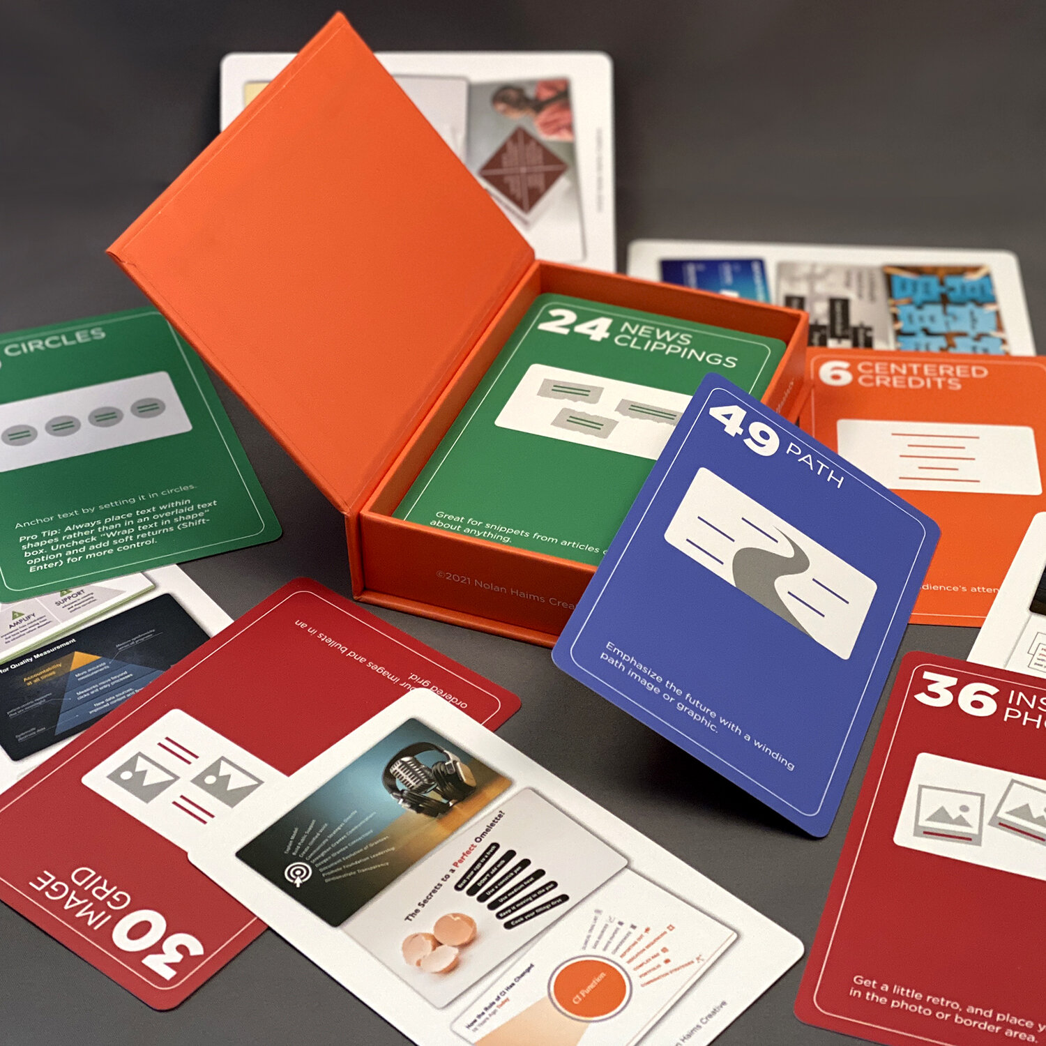
In the end, I found The Better Deck Deck by Nolan Haims. Essentially they are a bunch of flashcards showing deck ideas. This is not an essay about how to make great presentations, just a collection of examples which condenses excellent ideas and how to execute them.
Before I embark on any presentation project, I flip through these cards to get those creative juices flowing. If you do lots of presentations, I recommend it!
SmartArt isn’t stupid once you tear it apart.
If you believe bullet points are not the right direction, fret not; Microsoft PowerPoint agrees with you too.
In recent years, Microsoft PowerPoint has been improving on a function named “SmartArt”. It is an excellent tool for converting your bullet points into anything else. Today, they have galleries of ideas for you to choose from, including 3D.
 I’m just kidding. Please don’t choose a 3D SmartArt! I beg you!
Unfortunately, it’s too much of a good thing. SmartArt, as well as the fancier “Design Ideas”, doesn’t teach you which design is best for you, leading to stock templates and bullet points in various shapes and sizes. These days, I can tell which slides were designed by PowerPoint, not you.
Furthermore, because PowerPoint tightly merges design and content, it isn’t easy to customize SmartArt in any profound way. This includes translating any ideas you have from the reference guide in the previous tip to PowerPoint.
The key to making SmartArt do what you want is to convert it to shapes. Once your SmartArt loses its form, you can arrange and align your shapes in any way you please.
This is my current workflow: sketch the contours of my design in SmartArt, then refine it by converting it to shapes and working on them.
This opens many possibilities and speeds up your presentation production by quickly creating basic shapes and designs.
Don’t be a Presenter, Be a Coder: SlideDev
Everybody loves PowerPoint because it is WYSIWYG — what you see is what you get. It’s easy to understand the tools, and there’s comfort in getting what you want right from the development stage. Most alternatives to PowerPoint like Google Slides and Apple Keynote also rely heavily on WYSIWYG.
WYSIWYG is excellent for novice users, but it’s easy to outgrow them.
The first problem with PowerPoint is that it’s easy to be overwhelmed by the number of options. We had seen one of them already when we tried to create an ugly and unreadable 3D SmartArt. You can also wreck your presentation with different fonts and sizes and unprofessional-looking work.
If you’ve always wanted to approach a different approach, try Slidev.
SlideDev employs many features familiar to Coders — Markdown syntax, installation using npm and hosting on a website. You also get to write your presentation on your IDE, version control using git and include anything a website can do, such as embeds and CSS animations.
I can’t use Slidev at work because nobody knows how to read a markdown file, so don’t throw away your PowerPoint yet.
However, having tried it, I appreciated being able to condense the essential parts of making a presentation. Suppose you aren’t a coder but are very familiar with presentations. In that case, I recommend trying Slidev to get a taste of what it is like to code and increase your familiarity with web technologies.
Conclusion
I hope this post helped you with some new places to explore how to make your next presentation. During the pandemic, I searched high and low for ways to improve my presentations, and these are some of the things I found. Did you find something worth sharing? Feel free to let me know!
Would I still use Excel for Contract Management?Many people would like to use Excel to manage their contract data. After two years of operating such a system, would I still recommend it? Love.Law.Robots.Houfu
#tech #MicrosoftOffice #MicrosoftPowerPoint #Ideas #Slidev #Presentation #Books #Programming #Training
Love.Law.Robots. – A blog by Ang Hou Fu
- Discuss... this Post
- If you found this post useful, or like my work, a tip is always appreciated:
- Follow [this blog on the Fediverse]()
- Contact me:


